Design · August 2026 · 8 min read
Mobile App UI/UX: The Decisions That Make or Break Retention
Why the first session decides most of it, which design work is invisible until it is missing, and how to judge a design before it is built.
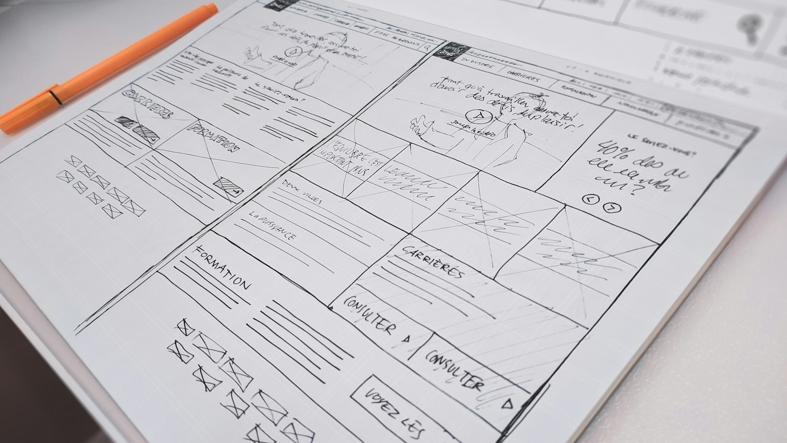
Most apps are not abandoned because they were ugly. They are abandoned because somebody could not work out what to do first, or hit a screen that asked for more than they were ready to give, or tapped something and nothing appeared to happen.
Mobile app UI/UX design is usually discussed as an aesthetic question and is mostly a comprehension one. The decisions that determine whether people come back are less about how the app looks than about whether it behaves the way its user already expected.
The first session decides most of it
A new user gives your app a short, distracted window to justify itself. They installed it for a reason, and everything between opening the app and that reason is friction they did not ask for.
This is why the most common onboarding mistake is asking for commitment before delivering value. A sign-up wall on the first screen, a permissions prompt with no context, a five-step tour of features nobody has needed yet - each is a request made before the app has earned anything.
The stronger pattern is to let people see something real first. Let them browse, search, calculate, whatever the app is for, and ask for an account at the moment it becomes necessary - when they want to save, sync or pay. The request then makes obvious sense, which is the only thing that makes it acceptable.
Ask for nothing until the app has given the user a reason to say yes.
Permissions are a conversation, not a dialog
Location, camera, contacts, notifications: each system prompt is a single chance. Denied permissions are awkward to recover, and a user who declines notifications on day one is unlikely to be asked again.
So the prompt should never be the first time the subject comes up. Explain in your own interface why the permission is needed and what it enables, immediately before triggering the system dialog, and trigger it at the moment the feature is being used rather than at launch.
Then design for refusal. A significant share of users will say no, and the app has to remain usable for them rather than degrading into a dead end.
Follow the platform instead of fighting it
iOS and Android users have years of accumulated habit about how navigation, gestures, dates, sharing and back behaviour work. Those habits are free comprehension, and a design that ignores them spends the user's attention on learning your conventions instead of using your product.
This is the strongest argument against shipping a single pixel-identical design to both platforms. The screens can share a visual language and a brand entirely; what should differ is the behaviour users already rely on - back navigation, system sheets, typography defaults, where the primary action sits.
Both Apple and Google publish detailed design guidance, and both review teams notice when an app ignores it. Consistency with the platform is also, incidentally, cheaper than inventing your own equivalents.
The states nobody designs
Design work is usually reviewed as a set of screens containing perfect data. Real usage spends a surprising amount of time in the other states, and when those are left undesigned they get improvised during the build, by whoever reaches them last.
| State | What happens if undesigned | What it should do |
|---|---|---|
| Empty | A blank screen that looks broken | Explain what goes here and offer the first action |
| Loading | A frozen interface and a second tap | Show progress, ideally in the shape of the content |
| Error | A raw technical message | Say what happened in plain words and what to do next |
| Offline | Silent failure or lost input | Say the connection is gone and keep what was typed |
| Long content | Truncated names and broken layouts | Handle overflow, long names and large font settings |
| First run | A tour, or nothing at all | Get the user to one useful outcome |
The empty state is the one worth most attention, because every user sees it and they see it at the exact moment they are deciding whether the app is worth their time.
These states are a large part of what separates a demo from a real product, which we covered in demo vs production-ready.
Perceived speed is a design problem
Users do not experience response times, they experience whether the app feels responsive. Those are different, and the gap between them is design work rather than engineering.
Immediate feedback on every tap, skeleton layouts instead of spinners, updating the interface optimistically while the request completes in the background, and loading the screen a user is heading towards before they arrive - all of these make an app feel faster without making it faster.
The reverse is also true. An app that is genuinely quick but gives no acknowledgement when tapped will be described as slow, and the bug report will be about performance.
Accessibility is ordinary quality
Support for larger text sizes, sufficient colour contrast, touch targets big enough to hit while walking, labels that make sense to a screen reader, and never using colour alone to carry meaning. This is usually filed under accessibility and treated as optional.
It is not optional, and it is not a minority concern. Larger text settings are extremely common. Contrast matters to everyone outdoors. Generous touch targets help every user on a moving train. Designing for the edges of ability tends to produce an app that is simply easier to use.
It is also far cheaper to design in than to retrofit, because retrofitting means revisiting layout decisions that have already been built.
How to judge a design before it is built
You do not need design training to review design work usefully. You need a small set of questions, asked while changes are still cheap.
- Give someone who has never seen it the app's main task and watch without helping. Where they hesitate is the answer.
- Ask what the primary action is on each screen. If it takes a moment to find, the screen has no hierarchy.
- Ask to see the empty, loading, error and offline versions of the important screens.
- Check it at the largest text size and on a small phone, not only on the designer's canvas.
- Count the steps from opening the app to the thing it is for. Then ask which of them could be removed.
That last question is the one that improves most apps. Almost every design has at least one screen that exists because it seemed logical rather than because a user needs it.
Design, build and store submission run as one project rather than separate handovers in our mobile app development work.
For a sense of how this comes out in finished products, have a look at apps we have shipped.
Frequently asked questions
What makes mobile app UI/UX design good?
Mostly that the app behaves the way its user already expected. Clear hierarchy on each screen, platform conventions left intact, the shortest honest path to the thing the app is for, and proper treatment of empty, loading and error states. Visual polish matters, but it does not rescue an app people cannot navigate.
Why do users abandon apps after the first session?
Usually because the app asked for something before it gave anything - a sign-up wall, an unexplained permission prompt, or a feature tour - or because they could not work out what to do first. The first session is a short window in which the app has to demonstrate why it was installed.
Should iOS and Android versions of an app look identical?
They should share a brand and a visual language, but not necessarily identical behaviour. Users on each platform have strong habits around navigation, gestures, back behaviour and system sheets, and those habits are free comprehension. Overriding them makes people learn your conventions instead of using your product.
How much does design matter compared with features?
Design largely determines whether the features get used at all. A capable app that people cannot navigate performs worse than a simpler one they understand immediately. Design also affects cost in the other direction: decisions made on screens are far cheaper to change than the same decisions made in code.
Is accessibility worth the extra effort in an app?
Yes, and it is rarely extra effort if it is designed in from the start. Larger text support, sufficient contrast, generous touch targets and sensible screen reader labels help far more people than the term suggests - anyone outdoors, anyone on a moving train, anyone who has increased their font size. Retrofitting it later means revisiting layout decisions that have already been built.
More posts
View All

Have a project in mind?
Tell us what you are building and we will come back with a scope, a timeline and a price.